"Be discreetly literal"
When I received the project brief. Indicating that this would be a product with
A wide range of consumers (Women between the ages of 18 and 55). That he should empathize with all of them. Think firstly about neutrality. A new product to be discovered immediately. So I decided to look for the form from the same name to integrate it with its effect and represent it with the application area.
A wide range of consumers (Women between the ages of 18 and 55). That he should empathize with all of them. Think firstly about neutrality. A new product to be discovered immediately. So I decided to look for the form from the same name to integrate it with its effect and represent it with the application area.
"Logotype development"
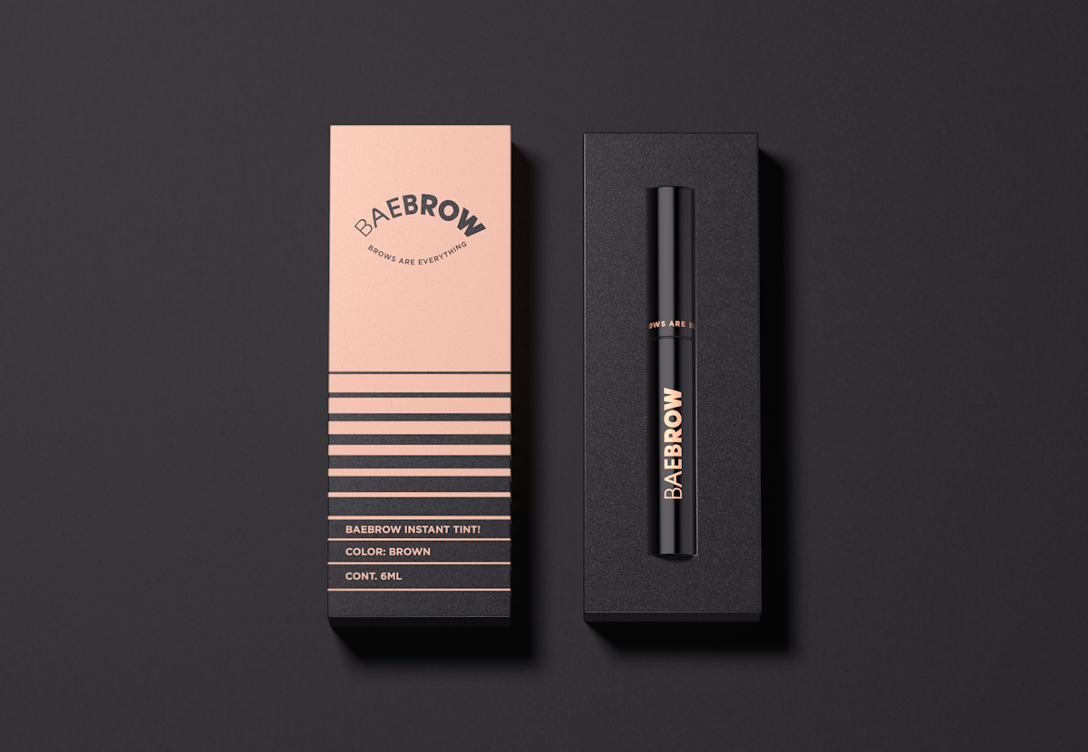
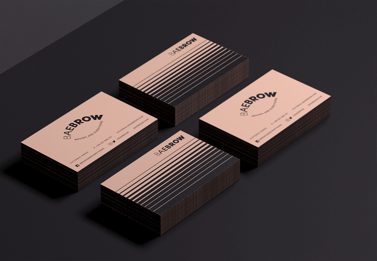
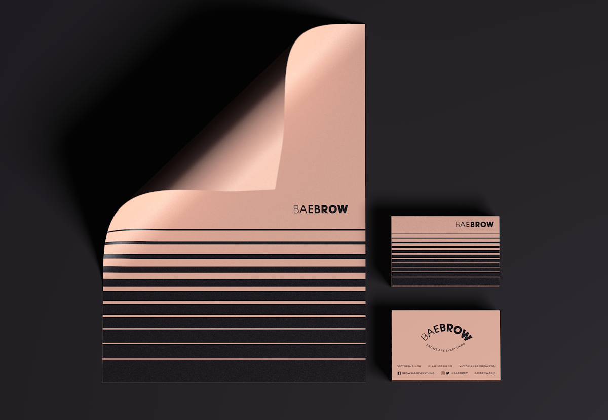
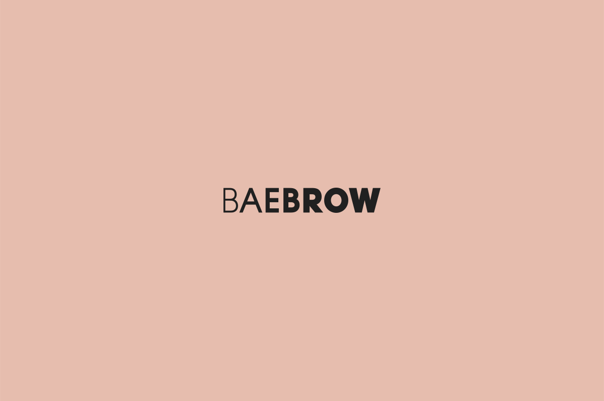
In order to continue product neutrality to connect with a wide range of consumers, the logo was created from a sans serif font (Gotham). Creating a progression from right to left, losing thickness as it approaches the end, as happens in reality with the eyebrows
But we still needed a symbol that says. For what reason the product was created. No need for the user's eyes to have to ask anything else to the packaging. This is a product for the eyebrows, the eyelashes say that the eyebrows are everything.
But we still needed a symbol that says. For what reason the product was created. No need for the user's eyes to have to ask anything else to the packaging. This is a product for the eyebrows, the eyelashes say that the eyebrows are everything.
"Graphic Style"
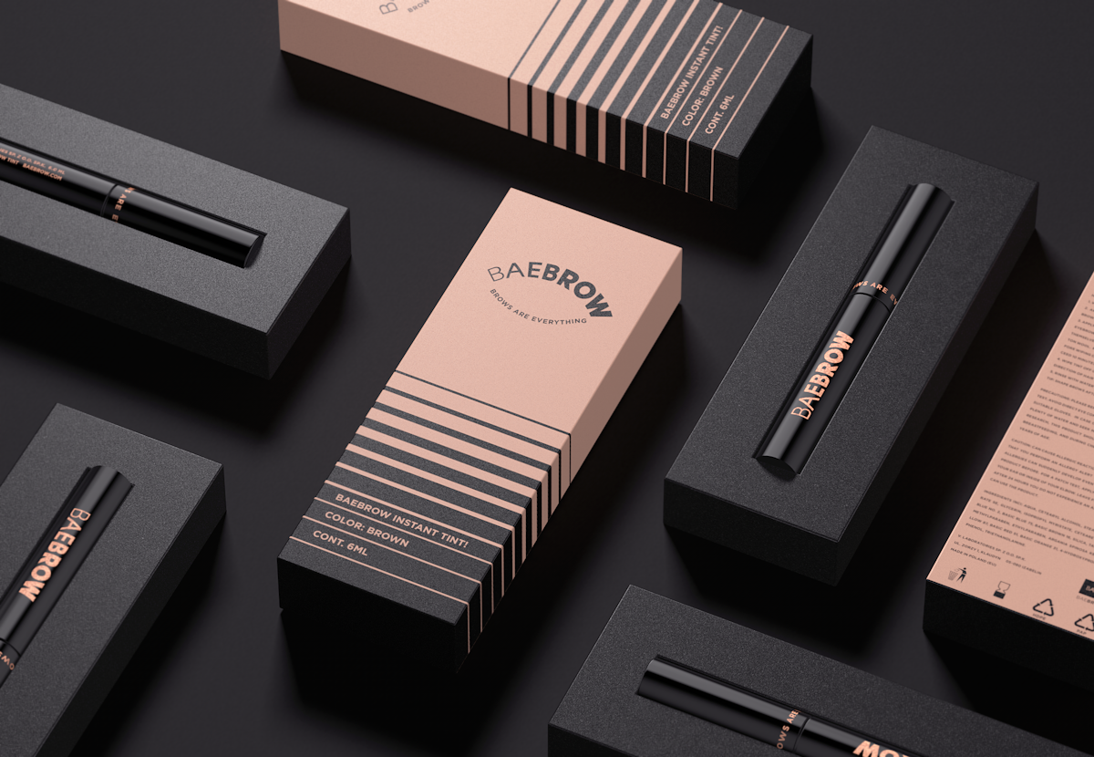
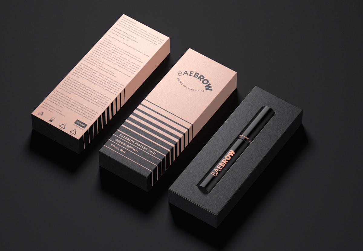
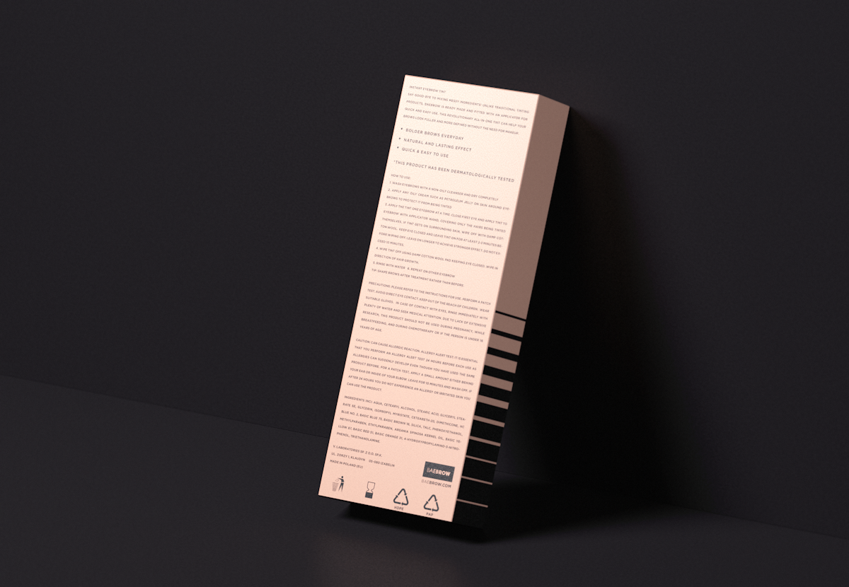
In the application of the product there are several steps, although only using this product without being necessary to use some additional one to obtain a thick eyebrow. "The stripes' progression" are an association with this process and result. In the end, a standard color of skin (Pantone 489 C) and black (Pantone Neutral Black C) Complemental and enclose the whole concept.