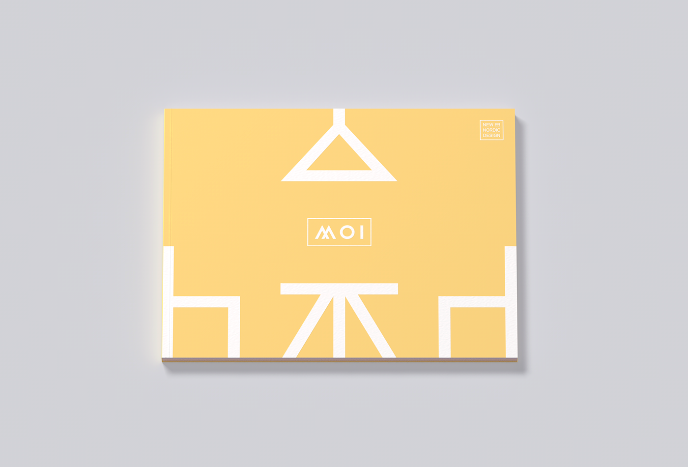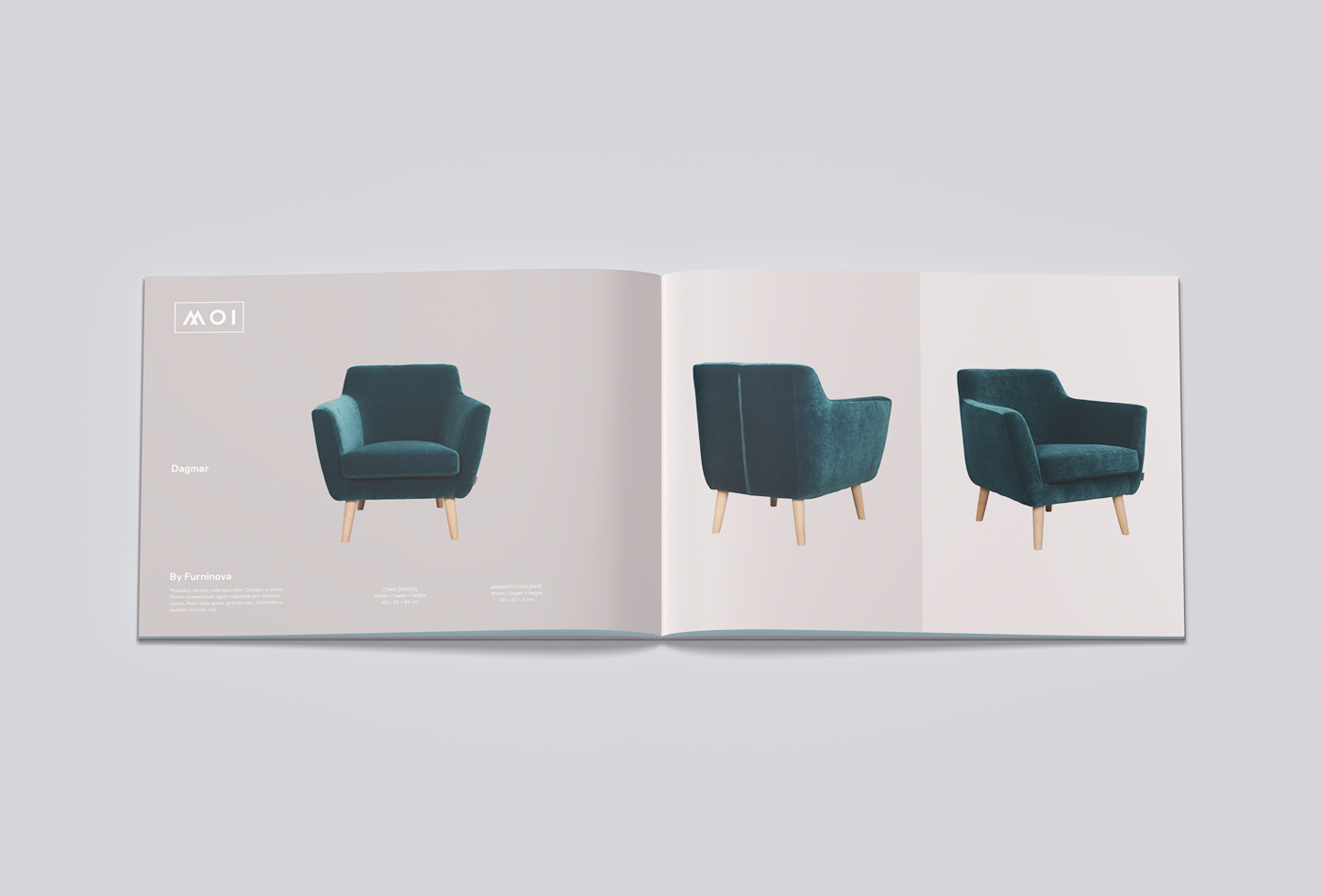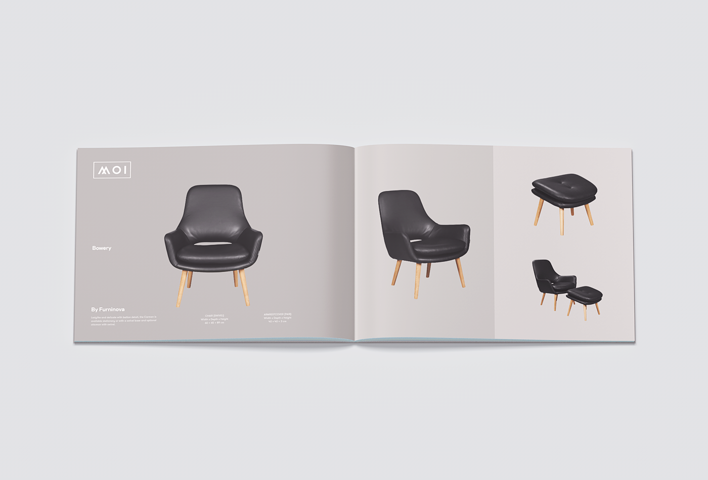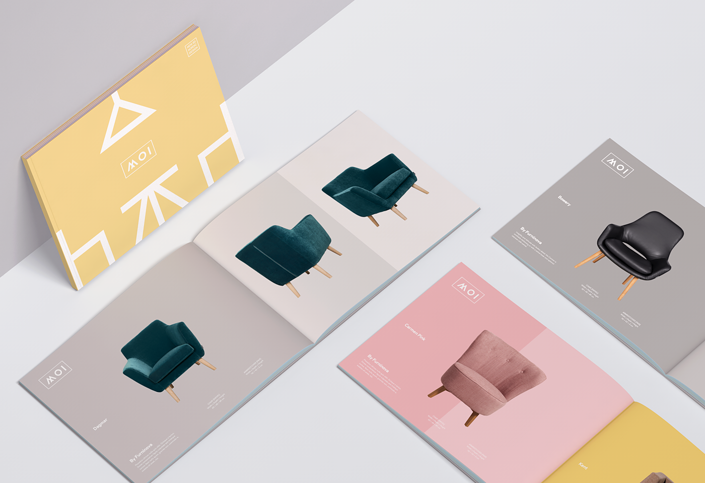
MOI is Scandinavian furniture brands store. Based in Bogotá - Colombia. I was hired in the early days of 2016 to create visual identity, stationery and packaging design. I was inspired for the simple forms of furniture design like Furninova creations. Most of the products available in MOI is created by Scandinavian brands. This gives me the inspiration to direct the concept towards there.
The Colors_
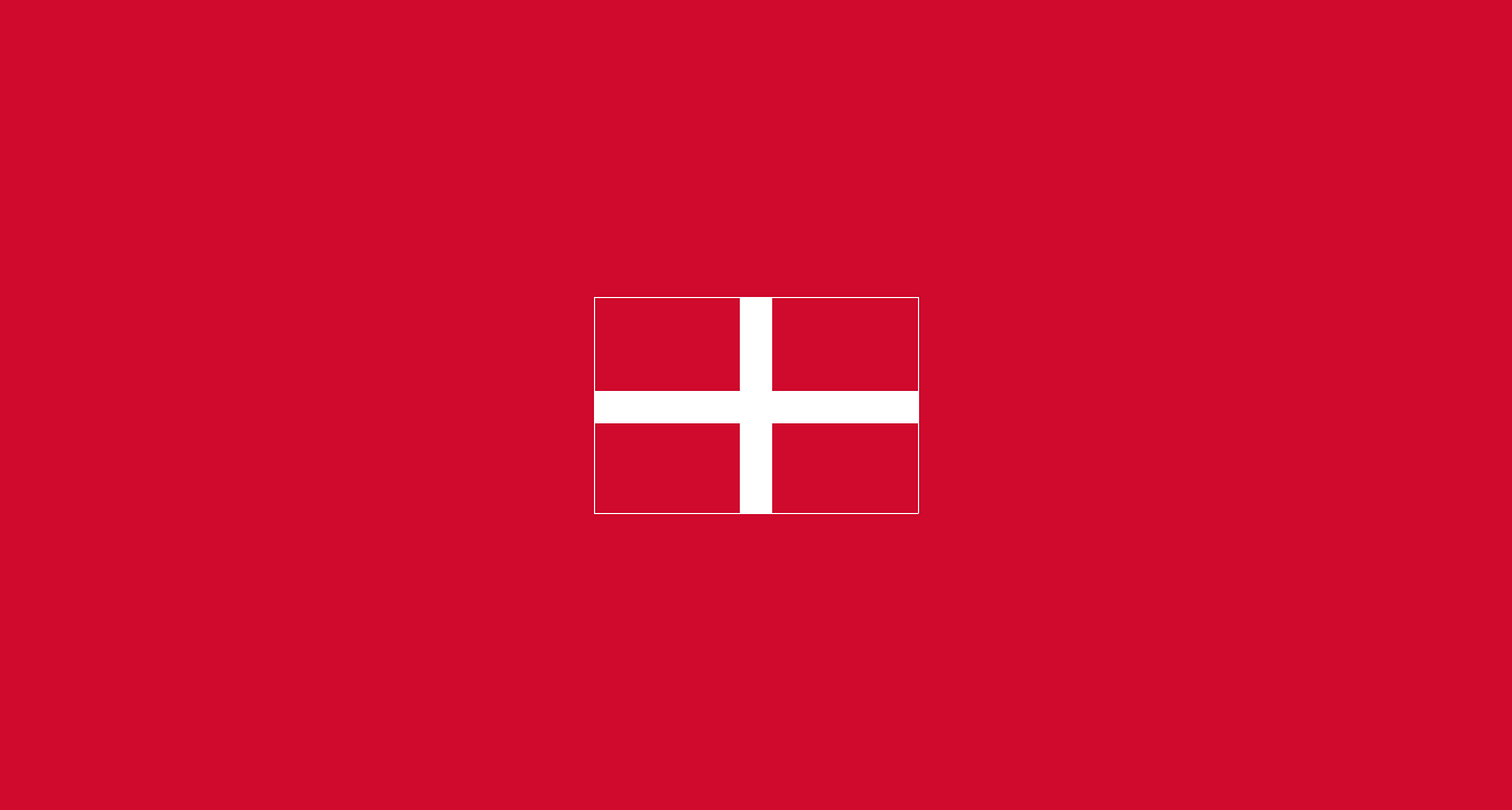
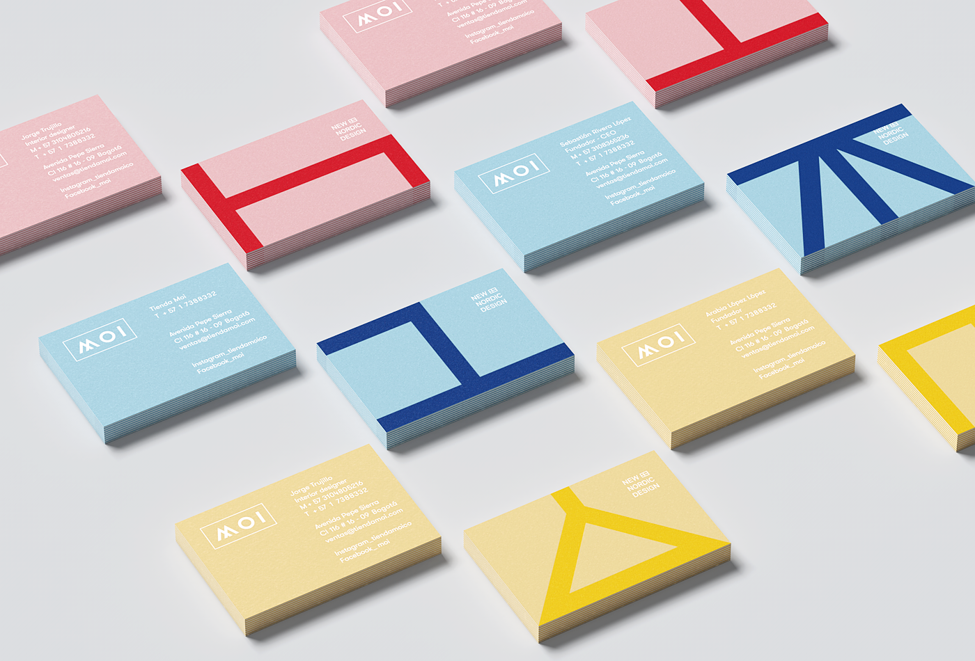
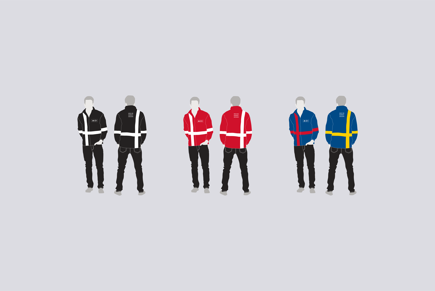
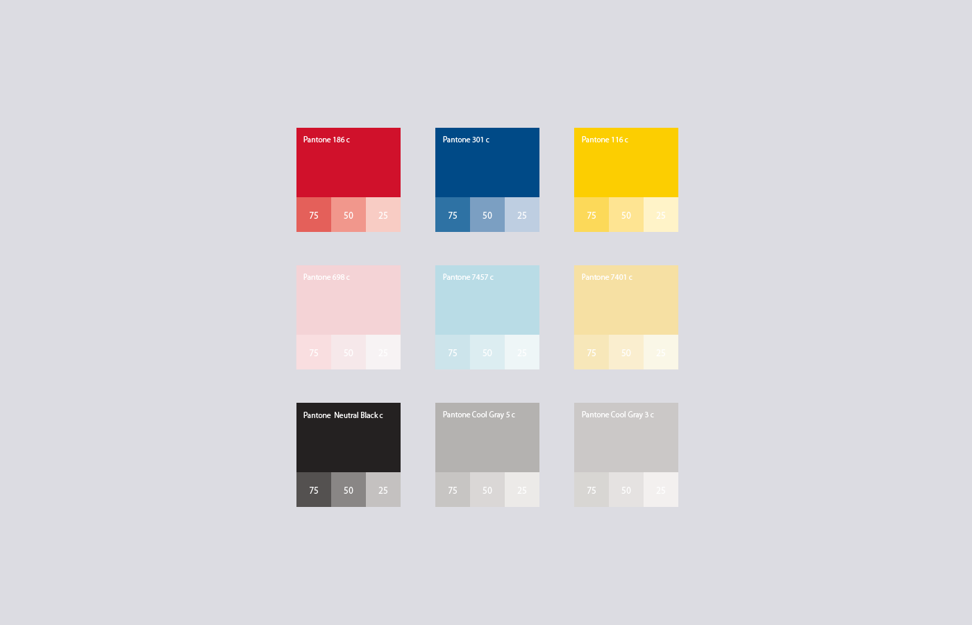
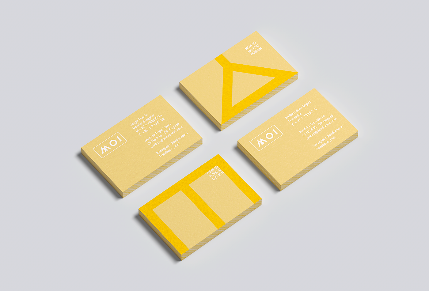
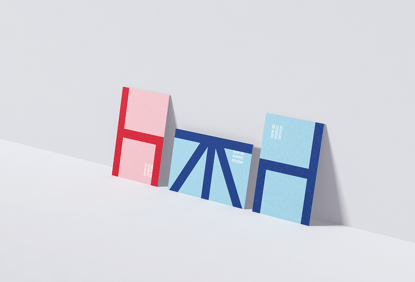
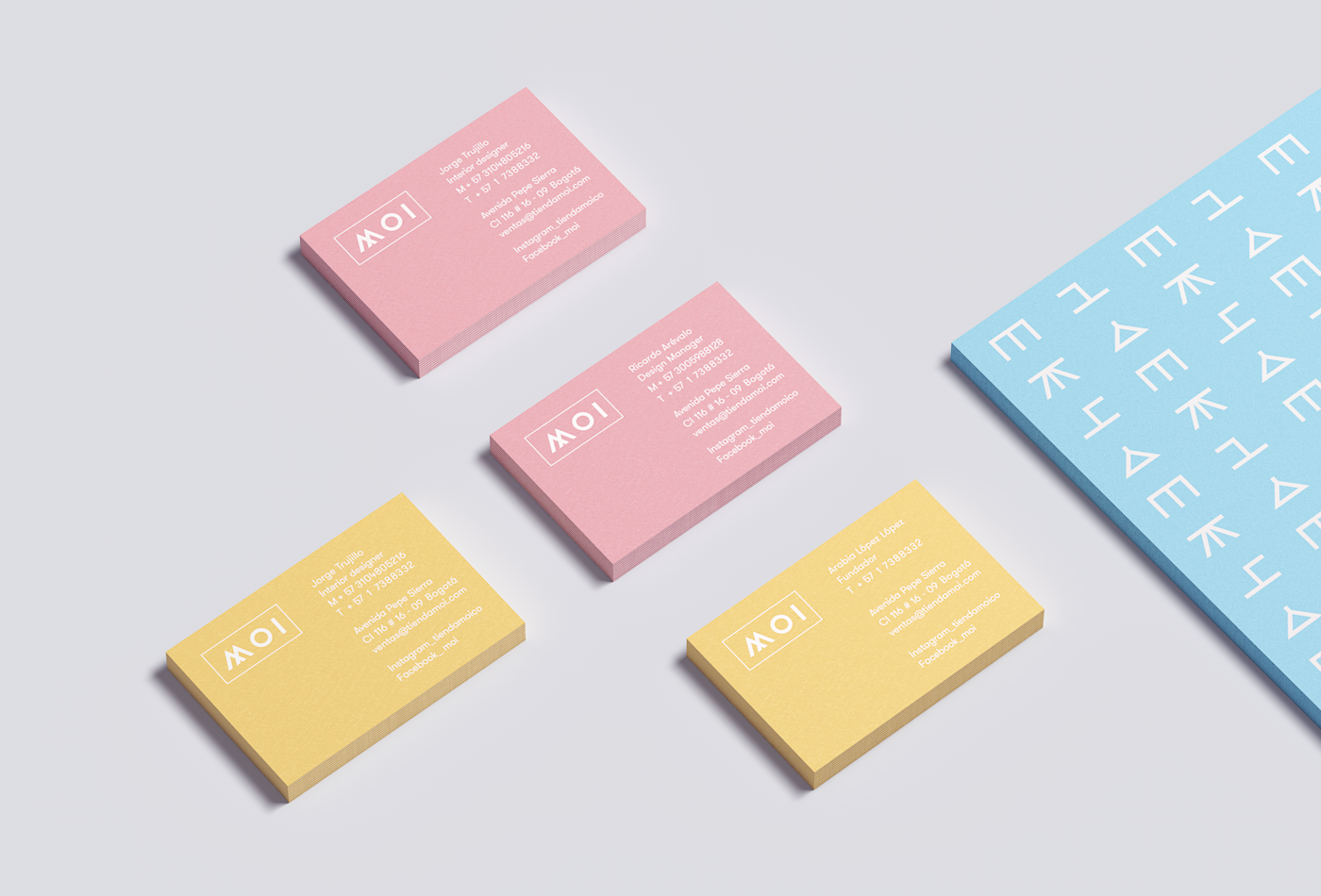
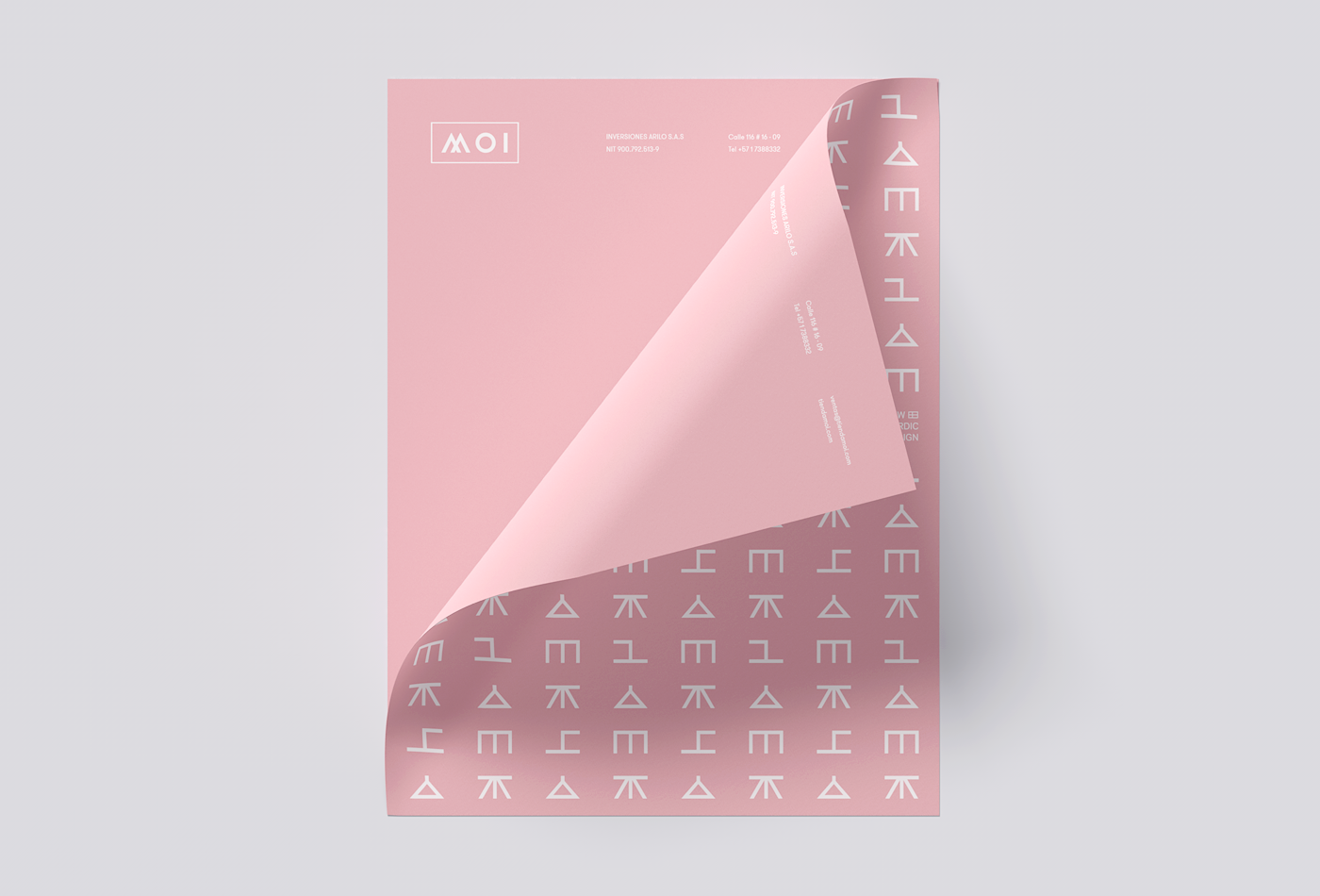
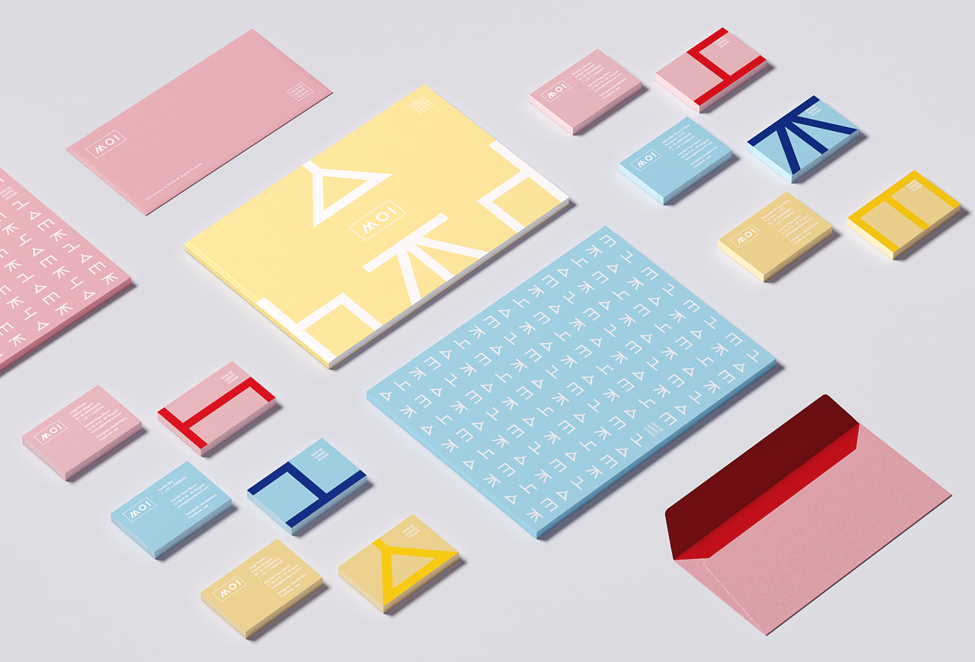
With a solid concept ready to be developed, I begin to think about the subject of colors. I did not want the brand to look very dark and cracked. The main colors of the identity of the Scandinavian countries are beautiful, but it was difficult for me to work alone with them. Thanks to "Nordic Co-operation" norden.org/en. I was able to get proper information about the colors of the flags. From there I embarked on a search for other colors Pantone (pastel colors) to create a balance and a cool mood, finally Pantone neutral black and cool gray to neutralize and complement a colorful range.
With a solid concept ready to be developed, I begin to think about the subject of colors. I did not want the brand to look very dark and cracked. The main colors of the identity of the Scandinavian countries are beautiful, but it was difficult for me to work alone with them. Thanks to "Nordic Co-operation" norden.org/en. I was able to get proper information about the colors of the flags. From there I embarked on a search for other colors Pantone (pastel colors) to create a balance and a cool mood, finally Pantone neutral black and cool gray to neutralize and complement a colorful range.
The Logotype_
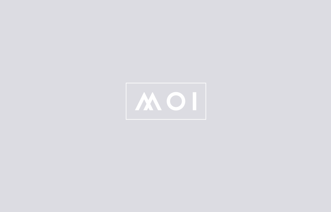
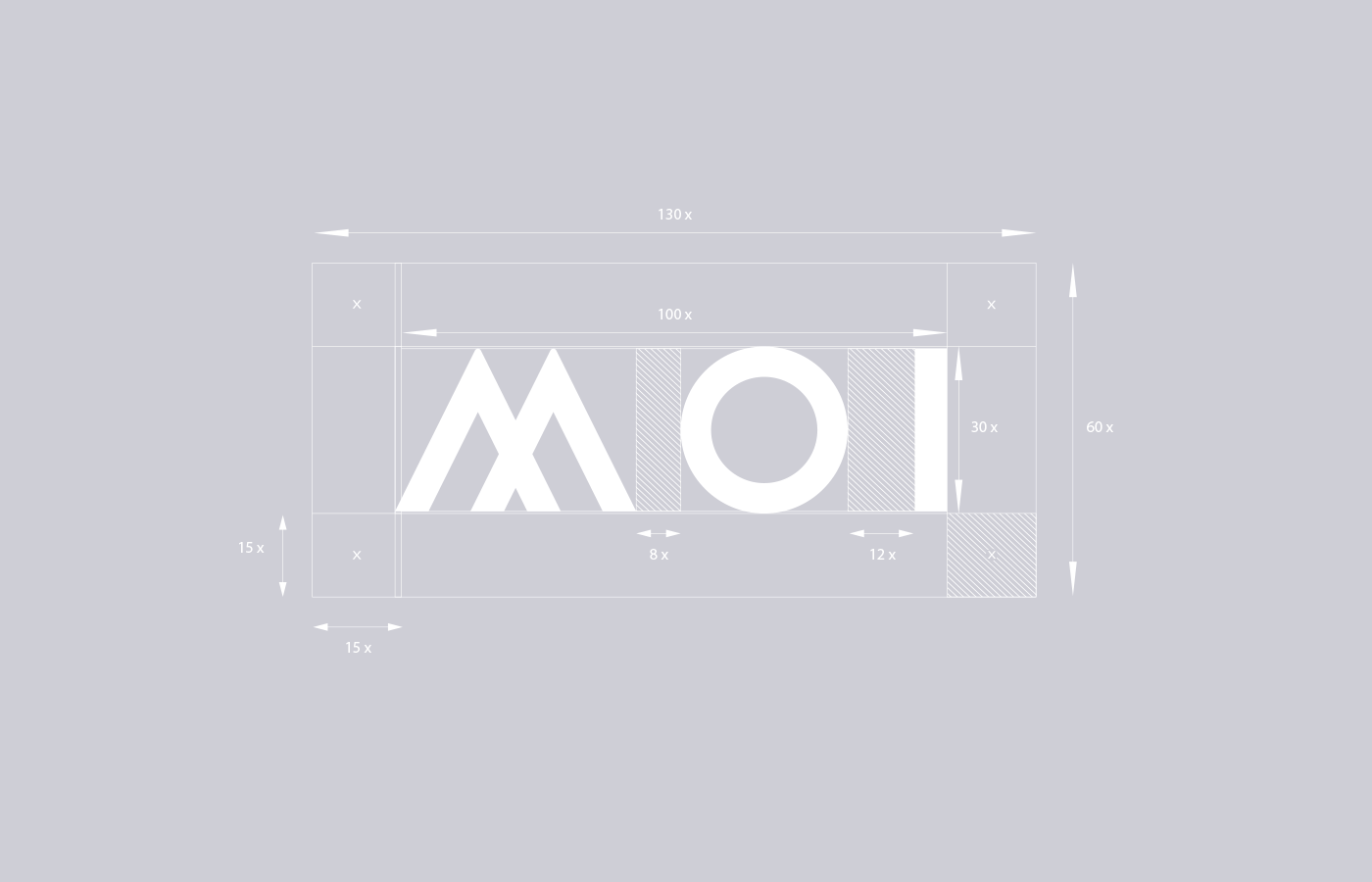
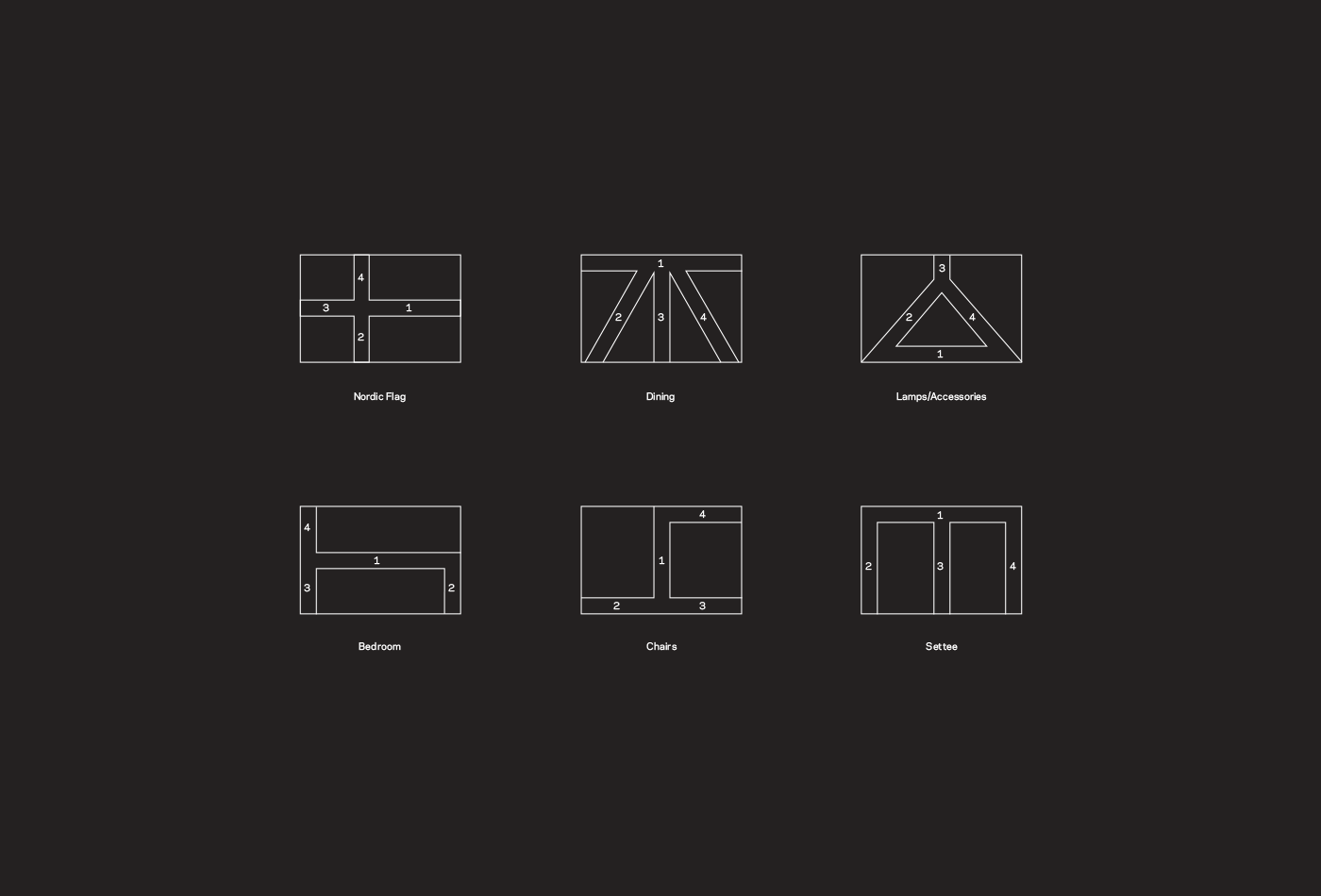
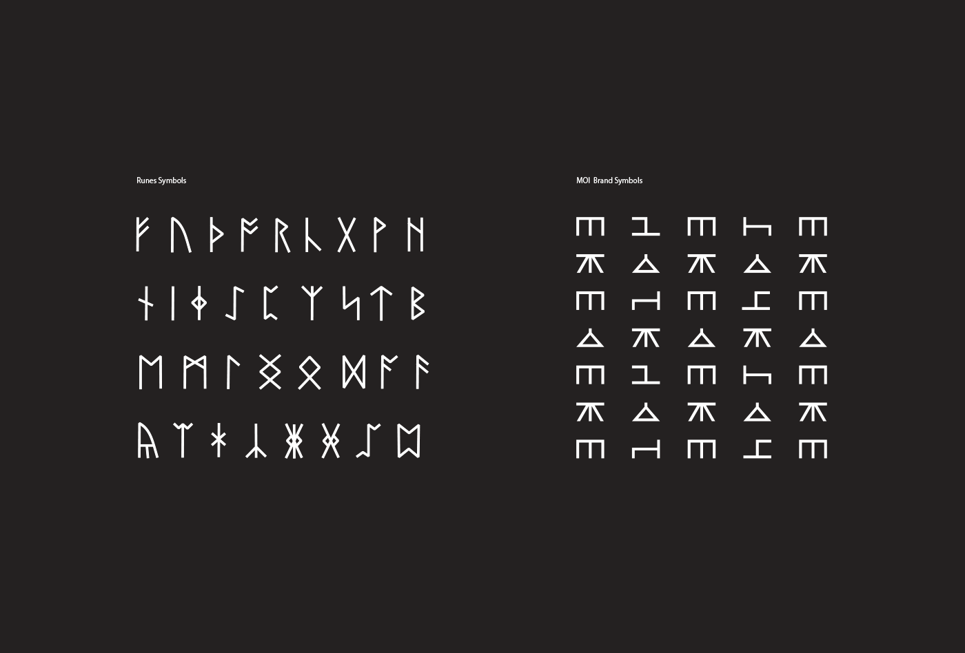
The shape of the "M" in the logo is created by the same formula of division (4) used in the "brand symbology". The contour of the logo seeks to give the element more character and strength, since it is a very short name. Also, to maintain the geometric style of the symbols created from the Nordic flags. Curiously, the logo was designed after the graphic style. The brand tagline "New Nordic Design" was created by me, to replace a generic "New European Design".
The shape of the "M" in the logo is created by the same formula of division (4) used in the "brand symbology". The contour of the logo seeks to give the element more character and strength, since it is a very short name. Also, to maintain the geometric style of the symbols created from the Nordic flags. Curiously, the logo was designed after the graphic style. The brand tagline "New Nordic Design" was created by me, to replace a generic "New European Design".